

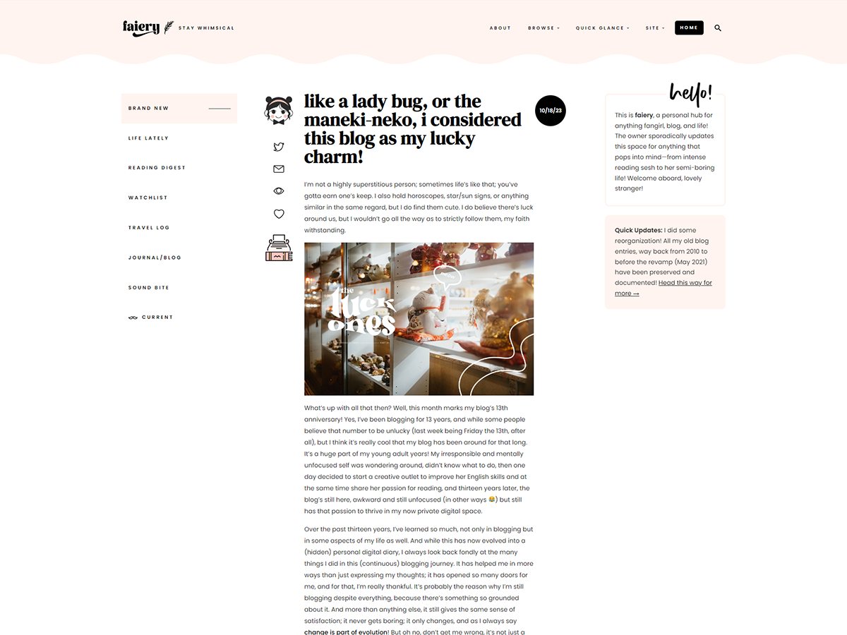
Every great design begins with an even better story!
Thirteen years is a long time. So many things have happened to this little space of mine, but one thing that I adore about blogging is creating a blog design. Oh dear, I donned too many designs in the past years, especially during my rainyink chapter (aeropapers has the same number, btw, but the blog name lasted for five years). I changed it so often even though that stint only lasted for two years—yes, just two years! But the bulk of the designs I will share today are from that era, so to speak.
Oh yes, as the second part of my blog anniversary celebratory posts, I’m sharing thirteen designs that shaped this blog! To be honest, I owe so much to my blog, from how I landed clients to eventually my work right now. It really helped me with my amateur skills; it was like my training ground, and it buffed my portfolio, which landed me my amazing job!


Anyway, here we go! The blog designs of the past and the present!
- Aeropapers 2011 – aerou’s longest design! I kept this for two years and my very full pledged design that I made from scratch! I’m full of pride in this one.
- Aeropapers 2014 – itching for very feminine and minimalistic design. I designed this while I was bored staying in Australia, then I coded it when I got home.
- Aeropapers 2014 (b) – my very first responsive design. This was me trying to incorporate my new awakened weeb persona into my very bookish self.
- Kyaa 2015 – an attempt to separate my bookworm and weeb personalities, I made a separate anime/manga blog called Kyaa. It was short-lived.
- Aeropapers 2015 – the last design under Aerou, which inspired the next design but under a different name and color scheme.
- Rainyink 2015 – trying to merge my two biggest passions at that time, I created Rainyink. The color palette was again a sad attempt to move away from the old blogging rep.
- Rainyink 2015 (b) – slowly getting back the pink/peach and more minimalistic, which was more of my style.
- Rainkyink 2016 – fully inspired by the owl, I shared the design process here.
- Rainkyink 2016 (b) – I wanted it to look more magazine-style and went back to my signature color, peach/pink!
- Rainyink 2017 – the last design under this name. I really loved this one; it looked neat and unique. A lot of the elements here were carried over to the next chapter of this blog.
- Faiery 2017 – silently changed my blog’s name and design. I promised to keep this design for a year, and guess what? It lasted three years! I’m pretty proud of this one!
- Faiery 2020 – I planned to change my blog design for my tenth blog anniversary, and though I managed to create it, I wasn’t a super fan of it. And with the whole pandemic and adulting responsibilities (work, life, etc.), it felt like I needed to not only change the design but my blogging behavior as well, which led to—
- Faiery 2021 to today ❤️ – I accepted that life has changed me, but there’s still this intense passion to blog! I compromised; I ditched that schedule and embraced the tl;dr style! I love this design so much, so no redesign is in the plans.
And there you have it. Woo! There were a few designs that I sadly didn’t get to keep (or lost in my old hard drive), especially around 2010, when I was blogging as Skye Station and the very first design for Aerou. But I am so happy to keep the majority of it! The title is a quote by “